Articles & Features
10 Modern Moments in Colour
By Artland Editors
It can be easy to take colour for granted, but as these ten moments remind us, colour should also present its own challenge. Colour can be a unifying cultural force, as Pantone reminds us every year with their Colour of the Year, or a socio-political issue, such as in Angelica Dass’s series Humanae. It can be an invention, an obsession or a possession (here’s looking at Anish Kapoor). Whatever colour means to you, you’ll be sure to see colour in a new light after learning about these ten modern moments in colour.
1. Capturing a colour zeitgeist with Pantone
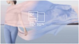
Each year, Pantone, the world’s leading colour authority, announces a colour that captures the zeitgeist of the year. For 2019, that colour is “Living Coral.” Unveiled at Art Basel Miami, this colour has moved beyond its oceanic origins, and links many disparate events together, from the variant of the iPhone XR to the tragic death of the Great Barrier Reef. Naming a colour that sums up an entire year is no mean feat. The difficulty of choosing just one led Pantone, in an unprecedented move, to anoint two colours of the year in 2016 — “Rose Quartz,” a pale pink, and “Serenity,” a baby blue. Not content with deciding colour of the year, Pantone also memorably created a new Pantone colour based based on the Minions from global film franchise Despicable Me in 2015. The development of Minion Yellow marks the first time in Pantone’s history that a colour has been created and named after a character.
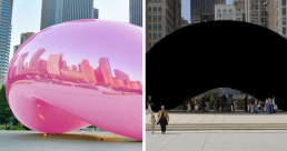
2. The battle between blackest black and the pinkest pink
Who knew colour could get stir up so much controversy. The darkest pigment in the Old Masters repertoire was a “bone black” made by burning animal bones in an air-free chamber. These days, technology has made it possible for black to become even blacker. Due to vertically-aligned nanotubles, Vantablack, invented by English company Surrey Nanosystems, captures light in a way that prevents perceptions of depth and dimension. Once news broke that British artist Anish Kapoor had been granted exclusive use of the hue, absolute mayhem broke loose, with the rumour mill claiming that Kapoor had been given exclusive rights to use the colour black.
British artist Stuart Semple addressed the situation in his own way by creating “Pinkest Pink,” which he put on sale on his website Culturehustle in December 2016. He included a legalistic warning:
“By adding this product to your cart you confirm that you are not Anish Kapoor, you are in no way affiliated to Anish Kapoor, you are not purchasing this item on behalf of Anish Kapoor or an associate of Anish Kapoor. To the best of your knowledge, information and belief this paint will not make its way into that hands of Anish Kapoor.”
Unfortunately for Semple, Kapoor got his hands on the pigment and Instagrammed it as proof. Undeterred, in 2017, Semple released Phaze, colour-changing acrylic paint, with similar restrictions. In the meantime, the rest of the world appears to have moved on.
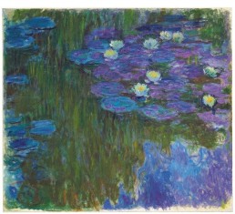
3. “Violettomania”
“I have finally discovered the true colour of the atmosphere,” Monet once declared. “It’s violet. Fresh air is violet.” The Impressionists — especially Monet — were downright obsessed with the colour violet, to the extent that critics accused the painters of having “violettomania.” Violet is everywhere in Monet’s paintings, from the purple shadows in his haystacks and lavender specks of light on his waterlilies. The one hue that you’ll never find in a Monet? Black. When he died, his friend Georges Clemenceau was aghast when Monet’s coffin was covered with a black sheet, and he insisted on replacing it with a flowered covering instead.
4. Seeing the colours that Darwin saw
Ever wondered what Charles Darwin’s journeys to Madeira, Canary, and Cape Verde islands on the HMS Beagle would look like in colour? We can take a pretty good guess because of Werner’s Nomenclature of Colours. Before Pantone, there was German mineralogist Abraham Gottlob Werner, who invented a colour system and outlined it in his Werner’s Nomenclature of Colours (1814). a detailed and thorough guide that catered to the needs of artists and scientists alike. Thanks to Werner, we know that Prussian Blue, for instance, can be located “in the beauty spot of a mallard’s wing, on the stamina of a bluish-purple anemone, or in a piece of blue copper ore.” Using Werner’s book, Darwin was able to describe the natural world in his journals with remarkable precision. The book has been republished in an affordable pocket-size edition by Smithsonian Books, so pick it up if you’d like to take a look at colour in the natural world the way Darwin did.
5. Edith Young’s art history palettes
“All my life I’ve pursued the perfect red,” sighed Diane Vreeland, once editor-in-chief of Vogue, in the 2011 documentary, The Eye Has To Travel. “I can never get painters to mix it for me. It’s exactly as if I’d said, ‘I want Rococo with a spot of Gothic in it and a bit of Buddhist temple’ — they have no idea what I’m talking about. About the best red is to copy the colour of a child’s cap in any Renaissance portrait.” After hearing Vreeland’s words, photographer Edith Young was inspired to create a series of art history-derived colour palettes, while she was still a student at RISD. Naturally, Young’s first released print was an answer to Vreeland’s dilemma, titled The Reds of the Red Caps in Renaissance Portraits. Since then, she’s released several more prints, including titles such as Caravaggio’s Boy with a Basket of Fruit, Lucian Freud’s Ex-Wives, The Blush of Madame de Pompadour’s Cheeks and John Currin’s Blondes.
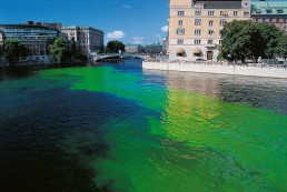
6. Olafur Eliasson’s greening of cities
In the Green River Project, Olafur Eliasson artificially colours a river temporarily green, using a nontoxic powder like that used by biologists to track water currents The public art series has been enacted in several cities, always anonymously and without advance notice. By colouring the river differently, Eliasson creates a kind of work he calls “phenomena-producers,” which alters the viewer’s engagement with the world. His rivers were so convincing that they sometimes produced more than a reconsideration of surroundings. In Stockholm, for example, newspapers featured the intensely green river on front pages, complete with a fabricated explanation. Reporters blamed leaking fluid from a government heating system when the explanation, in fact, was nothing other than art.
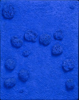
7. Yves Klein’s blue “monochromes”
Much has already been written about Yves Klein’s affinity for blue, which was said to have begun with the deep cerulean skies of the French Mediterranean. After discovering, in collaboration with a chemical retailer, a polymer binder that could maintain the intensity of his blue pigment, Klein dubbed the shade International Klein Blue (IKB) and set about making objects of various forms with it: powdery blue colour fields and sculptures soaked in the colour. Such was his fascination with blue that Klein would sometimes quote literary critic and philosopher Gaston Bachelard, who wrote: “First there is nothing, then there is a deep nothing, then there is a blue depth.”
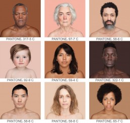
8. Angelica Dass and the Shades of Being Human
“Using this scale, I am sure that nobody is ‘black,’ and absolutely nobody is ‘white’… these kinds of concepts that we used in the past are completely nonsense,” Brazillian artist Angelica Dass told Newsweek. Since 2012, Dass has been photographing people of every colour and matching each subject’s skin tone to hues from the Pantone printing colour chart, based on an 11-by-11-pixel sample taken from each subject’s nose. The project, titled “Humanae,” was inspired after people began speculating about what her own children with her Spanish husband might look like, and her reflections on how skin tone spans “pancakes to peanuts to chocolate” in her family alone. Attention to skin tone has thankfully become more common in the last couple of years. Let us hope that it’s a move that stays in fashion.
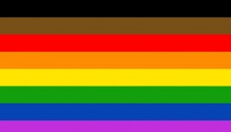
9. The many shades of inclusivity in pride
In 2017, a new pride flag was unveiled at the gay pride festivities in Philadelphia. In a quest to be more inclusive, activists had added new brown and black stripes above the traditional top red stripe, which were intended to represent LGBT people of colour. For some, the new stripes felt like an unnecessary alteration. However, the original pride flag, designed by artist-activist Gilbert Baker in 1978, actually also had more colours than the typical six. The original flag had eight colours: at the top was hot pink, which represented sex, red for life, orange for healing, yellow signifying sunlight, green for nature, turquoise to represent art, indigo for harmony, and finally violet at the bottom for spirit. The pride flag has become quite an iconic design; in 2015, the Museum of Modern Art’s added the flag to its permanent collection. Like many a masterpiece, the original pride flag has inspired many a modern update. In response to the Philadelphia controversy, Portland-based designer Daniel Quasar has proposed a new design in his project called “Progress: A PRIDE Flag Reboot,” introducing four extra symbolic hues in an effort to be more inclusive.
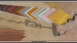
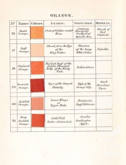
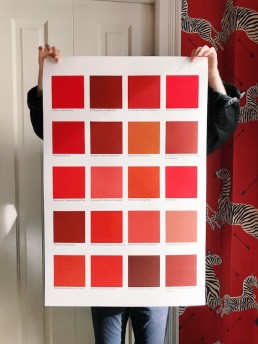
10. Colour as commodity
In 1918, the French avant-garde artist Marcel Duchamp picked up his brush after a four-year hiatus. He created this work, titled rather eccentrically “T um’,” an abbreviation of the French phrase “tu m’ennuies,” or “you bore me.” After completing this painting, Duchamp never painted another picture until his death in 1968. What is most striking about this painting is not the allusions to Duchamp’s readymades, but the the array of colourful tiles, which foreshadow a turn in the way we think about colour. In 1918, pigment samples from commercial colour charts were still a novelty, having only really been in use since the end of the previous century. These colour swatches depicted not only different hues, but a new way of looking at colour itself — colour as commodity. While we are all used to Pantone swatches now, that clash in sensibilities was still new in 1968, a difference in approach best illustrated by the difference between two publications from 1963. It was the year Josef Albers released his treatise, Interaction of Colour, which provides guidelines on the harmony of hues. It was also the year that Pantone first published its encyclopaedic compendium of colour, paving the way for a new and modern perception of colour as commodity.